Venetian Plaster News (Year 2006)
Also read the news for years 2025, 2024, 2023, 2022, 2021, 2020, 2019, 2018, 2017, 2016, 2015, 2014, 2013, 2012, 2011, 2010, 2009, 2008, 2007, 2005, 2004, 2003

Posted on 23/10/2006
The Norwegian name for Iceland is 'The Land of Ice'. The images of the country which usually spring to mind are devoid of colour: snow white and black lava rock.
During the short polar spring, however, green colours dominate the extensive landscape like nowhere else on earth.
The natural world here undergoes a constant process of renewal. When snow melts, pure water pours down breathtaking waterfalls onto rich fertile land, allowing low-lying vegetation to thrive from the endless plains to the most inaccessible fjords.
Giorgio's search for a green for his COLORI dell' ANIMA finally came up trumps in Iceland.
A search which will soon be complete and which is bound to once again enrich the lives of those of us eagerly waiting for the launch of the Colori dell'Anima.

Posted on 02/10/2006
Every man's dream: the feeling of being a Free Spirit, without restrictions, rules or impositions.
This is the name of out latest innovation: Spirito Libero. Imagination, colour and simple application for your creative freedom.
In a world overflowing with regulations, laws and prescriptions, you are free to dream and create the colours which move you most for your house, the place where you are master and creator.
Spirito Libero is produced using lime, marble dust and natural minerals.
Cera del Vecchio and Antichi Sapori are made using beeswax and natural soap.
One spatula-applied coat of Spirito Libero and a wax finish (Cera del Vecchio, Antichi Sapori, Oro Puro e Bianco) create an old-fashioned natural surface characteristic of lived-in antiqued stucco walls. The simplicity of the product and its range of colours with different wax coatings make it an open system which lets your imagination run wild.

Posted on 10/09/2006
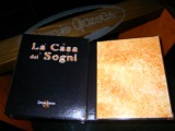
The applied version of the Casa Dei Sogni catalogue for painters has been available for a fortnight.
This useful work tool is a must-have item for painters and is on sale for 50 Euro.
It contains a postcard for inclusion on our site, a major reasonably-priced advertising initiative for every painter.

Posted on 30/08/2006
Giorgio Graesan & Friends has been operational since the first of August 2006.
There are several reasons for this change: tax reasons; banking matters; advertising aspects.
These reasons have already been clarified in other communiqués.
But the most significant aspect of this change is of a philosophical nature, it has been outlined in a letter sent to all the FRIENDS, which YOU WILL FIND BY CLICKING HERE
, it contains an explanation for the deep-rooted meaning of this new corporate name.
WE HOPE THAT YOU ENJOY READING IT.

Posted on 09/05/2006
CASTORO srl was founded in 1984.
Twenty-two years ago.
At the time the company produced wooden profiles and the name and symbol referred to the sharp toothed beaver who cleverly works wood to build his home.
It was a perfect name for us.
In 1987 we began experimenting with decorative paints with the
Aquaria, tinned wall paints range.
This concept of decoration was unheard of at the time and traditional paints rich in plastic resins and produced using technological and colorimetric systems were becoming more and more common.
Against the odds we launched the manual and artisan's pigment preparation technology and we re-launched Venetian style Stuccos with Spatula Stuhhi.
We invested extensively in marketing to create a niche within the market for those artisans who saw themselves as artists.
That niche grew and grew and we now hold an important position within a market that may be small but that is sincere and durable, so much so that we recently celebrated the
Fifteenth anniversary of Spatula Stuhhi
We now produce and distribute
NATURAL COLOURS AND EMOTIONS.
It is quite clear that the name CASTORO is no longer suitable for accompanying our business throughout its future developments.
We would therefore like to inform you that over the next few months our company will change its name, becoming
Giorgio Graesan s.a.s.
We are now ready to deal with all the commitments and challenges that we will be faced with over the next twenty years.
Continuing to produce a rainbow of colours,
We remain yours faithfully,

Posted on 21/03/2006
As post-war children, we know that the United Nations issued a list of the fundamental rights which a man has from the moment he is born.
The purpose of this list was to prevent humanity from repeating the barbarity which had been seen in preceding years and to remind every man, present and future, that reciprocal esteem and respect for human differences form the basis of a healthy mind and relationships on our planet.
But are our children familiar with this list of fundamental rights?
Are they ready to fight and protect them as if they had created them?
And will our grandchildren learn about them?
For those interested, we are organising distribution of a DVD which was presented during the fair and met with resounding success.
We aim to raise awareness of this valuable knowledge which is absolutely vital for building our certainties.
Giorgio Graesan
-The photo shows music video director Taron Lexton (on the right) and rapper Charles Gee.-
Click here for more information on our initiative to raise HUMAN RIGHTS awareness

Posted on 20/03/2006
We spent a week of Emotions and Natural Colours (Emozioni e Colori Naturali) together with all the other participants and met with unprecedented approval:
Click here to enter the Saie 2006 galleries
Click here to enter Giorgio Graesan's Saie presentation site
Click here for more information on our initiative to raise HUMAN RIGHTS awareness
We set about making our brand and our philosophy better known by publicising six features day by day:
The presentation of the new SPATULA STUHHI OPACO with ANTICHI SAPORI met with the approval of trade professionals and customers who were looking for a matt product which can be applied using just two coats with an Antichi Sapori finish, a period-style wax specially designed for the new look of SPATULA STUHHI OPACO. (Click here to see the relevant page of the manual)
The catalogue QUINDICI ANNI of SPATULA STUHHI was warmly received by all those in the trade.
It is a presentation of Spatula Stuhhi with the ability to take your breath away, similar to the effect of a catalogue of precious jewellery for ladies; but it is also a magazine with photos of SPATULA STUHHI applications and lots of reading material on its philosophy.
Don't forget to ask your favourite distributor for a copy.
We presented the new 'RE'. A 'ROYAL' SPATULA STUHHI catalogue which provides a reminder of our JEWEL CASE and allows customers to see colours from every SPATULA STUHHI collection applied to little tiles inside...


